Contemporary wood wallpaper

We love when clients present us with unique challenges. In this case, it's a young Chicago professional who wants a media room that reflects his love of hunting, nature and the outdoors while fitting with his modern urban home. No overt hunting lodges or folksy cabins here. The look is to be upscale, contemporary and comfortable with subtle winks towards that more rustic aesthetic.
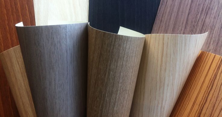
Wood wall coverings are a perfect material for this challenge. Not panels!  This is not your 1970's basement wood panelling! Modern wood-look wall coverings and wallpapers are made of phthalate-free vinyl with the grain of real wood. They're amazingly realistic and versatile, ranging from sleek finishes that work beautifully to emphasize architecture to more rustic styles full of grooves and knots and color variation. The samples above are from Innovations USA Hudson line but we also love....


the Renaissance line from Concertex which comes in a variety of stains and grains...
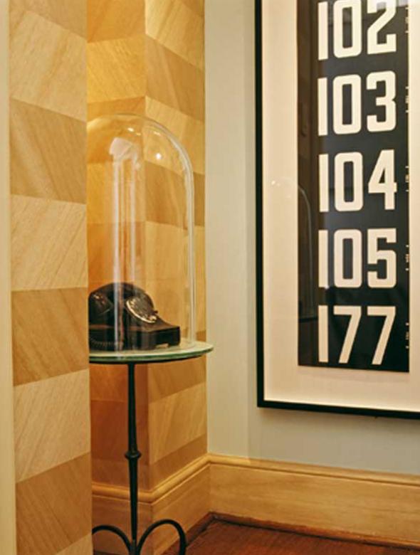
 

and Maya Romanoff's Ajira collection which comes in grain patterns like the Ajira Chevron above.

Stay tuned as this project develops! It's such a fun concept, the final product is going to be amazing!
Accenting the ceiling with unique materials

Poor old ceilings. They're so often neglected in the design of a room.  There's no quicker way to take a space from "Oh, that's pretty" to "Wow!" than to add detail to the ceiling. After all, it is the 5th wall of any room!

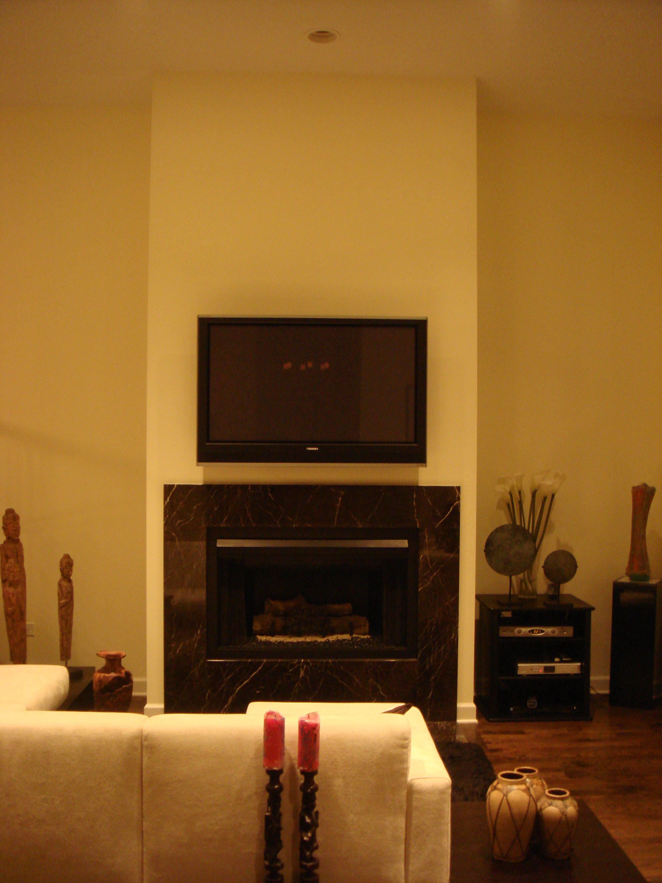
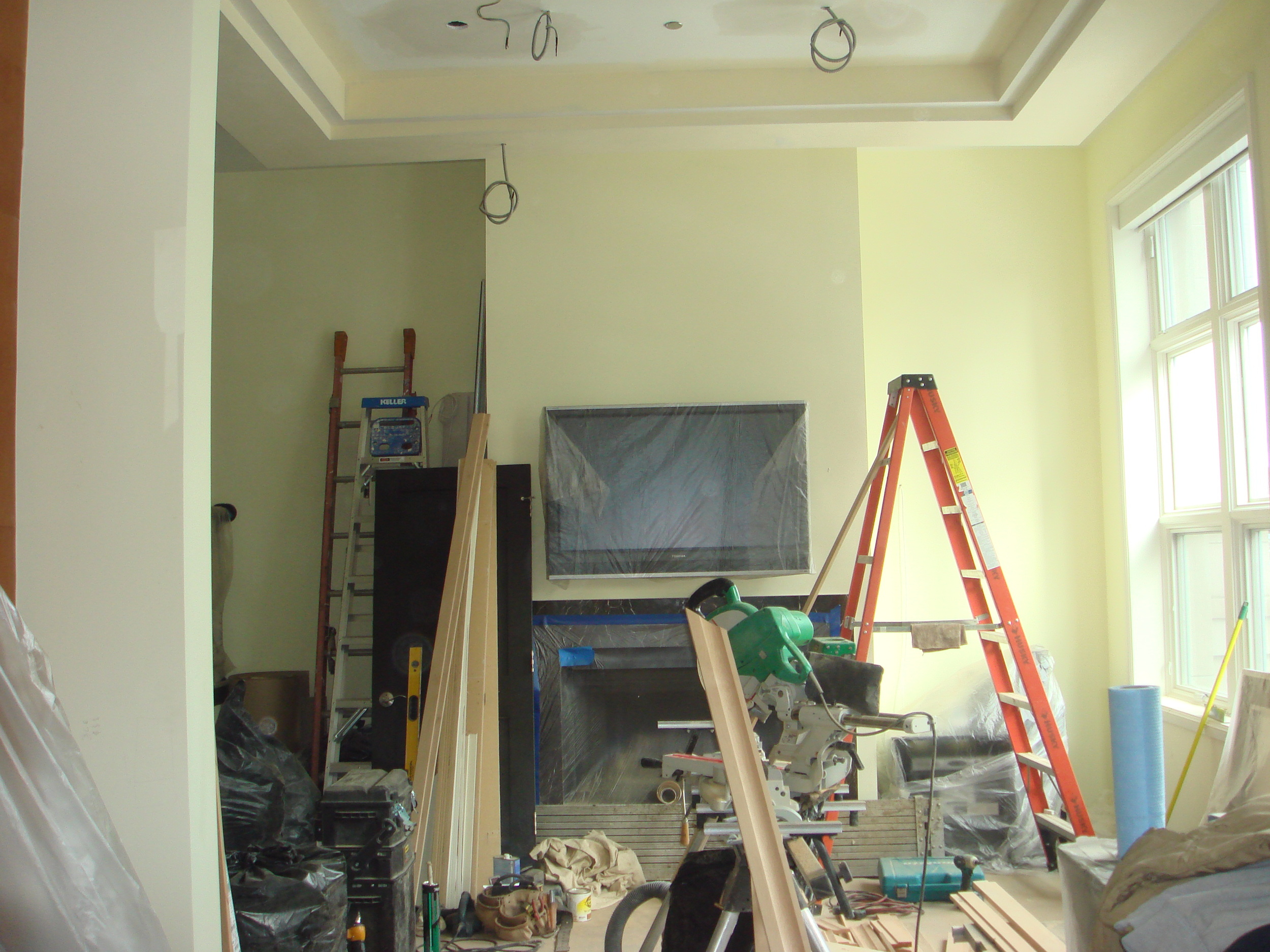
Let's take a trip back in time and look at some pics of this Chicago condo (whose powder room was featured on the blog last week) before we got our hands on it.

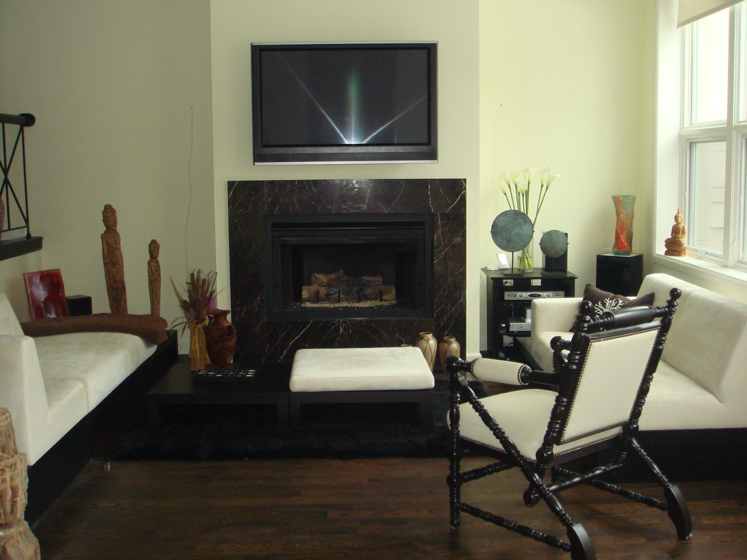
It's a great space... a big fireplace focal point, tall windows looking out onto the Chicago River, and thirteen foot ceilings.

Everyone loves high ceilings. It's open and airy and grand, no doubt there. But there are challenges when dealing with all that height. The large volume of empty space created by high ceilings can dwarf furnishings and just feel cavernous. Add to that the special challenges of this room...the small footprint which made that  height feel out of balance, and the raised dining room and kitchen to the left, whose view of the river ran right through the vast emptiness above the living room, and we knew we needed to address the ceiling.

We began by building out a rectangular soffit, mirroring the shape of the room and defining the living area from the rest of the open plan first floor.


Already, it's looking better.

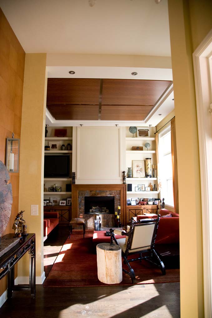
Since the goal was a warm, textured room full of art and artifacts and beautiful details, additional detail was needed to bring the ceiling up to snuff. Four beautiful wood panels were installed in the soffit with recessed lighting glowing softly behind and can lights around the perimeter for flexibility.


Now the rich wood draws the eye up and pulls the "5th wall" down, allowing it to become a part of the composed space. As Deb said, "We could've fill this room with treasures and you would never know. They'd be swallowed up."

Now the ceiling itself is a treasure.

Metal kitchen countertops, a great granite alternative

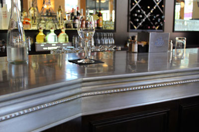
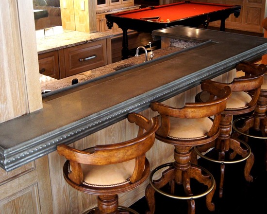
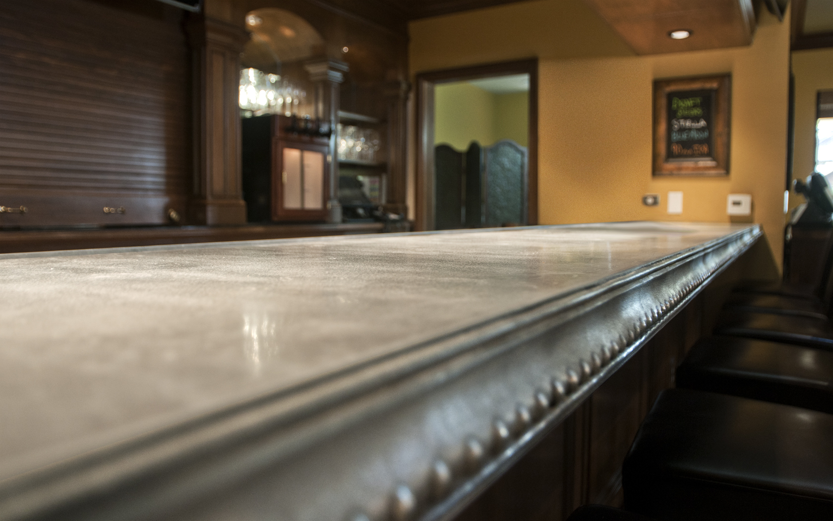
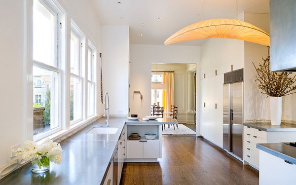
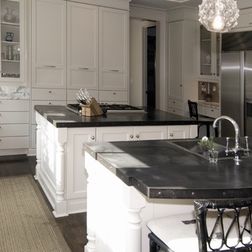
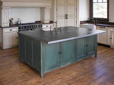
While most designers would agree that you can never go wrong with a gorgeous granite countertop, it is always refreshing to see unique alternatives for counters and tabletops. I recently came across a great resource for zinc and copper countertops, which aside from looking cool, offer some great properties like a natural anti-microbial property which makes them easy to keep sanitary.  The suggested cleaning method for these counters is just a simple soap and water wash.  This malleable metal also can be done with extremely unique and special edge details, different from their stone counterparts.  This adds another level of customization and another cool textural element to a space.

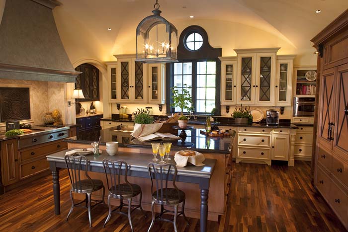
These countertops will not perform like a granite or other hard stone.  They are metal and are therefore reactive to everything from air, water, lemon juice, cleaning agents and wine, but that is part of the appeal!  The beautiful patina they create brings in a very special old world charm- perfect for the Tuscan inspired kitchen.  Other great applications would be in a bar area of the home, or even in a library for a desk top.

Check out some gorgeous applications for this cool product.


Trash to Treasure: Home Goods Made From Recycled Materials

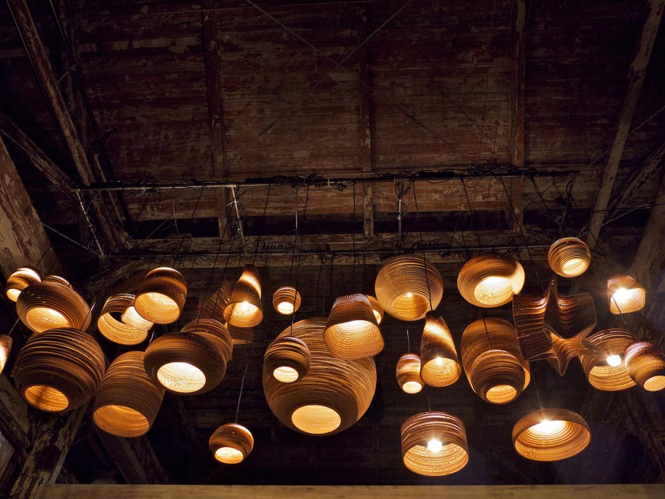
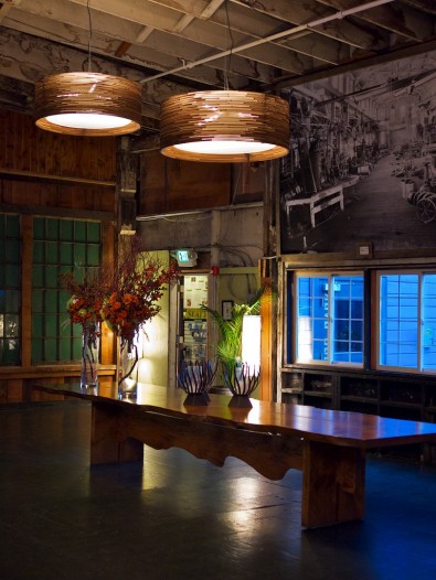
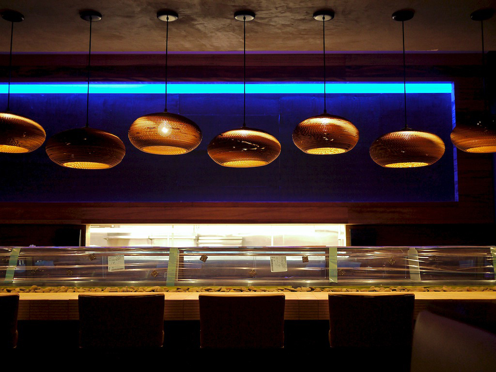
With our world rapidly depleting our natural resources, a new emphasis is being placed on green building products.  While many of these products use processes that are lower in chemicals and pollutants, many still use a large percentage of new products.  Some innovative companies have come out with products made entirely of previously used materials (i.e. trash). One amazing example is graypants, a remarkable lighting and furniture company based out of Seattle.  The brain child of architects Seth Grizzle, Jonathan Junker and Jon Gentry, graypants was founded in 2008, when the guys realized they missed designing and building useful things.  In their spare time, they started collecting various discarded materials and experimenting to see what they could come up with.  Soon after, their scrap lights were born- unique shapes made from stacked corrugated cardboard.  After several years, they have expanded their line to include many different shapes and sizes of lights as well as unique furniture.

Check out some pictures of their amazing lights!

Love these amazing pendants!

Gorgeous New Fall Colors!

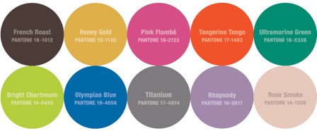
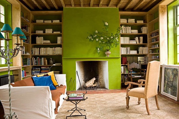
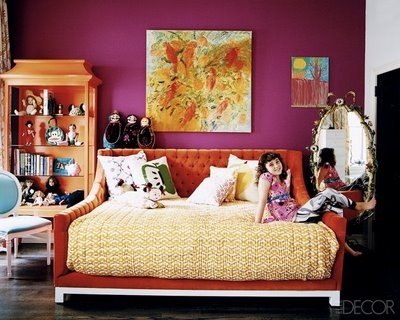
Pantone, a standardized color system and a world renowned authority on color trends, recently released their hot colors for fall 2012.  While some are the typical fall standards such as the gorgeous dark brown "French Roast", warm "Honey Gold" and the 2012 colors of the year "Tangerine Tango", they also included in the mix some unexpected colors.  I am loving the beautiful "Bright Chartreuse", "Olympian Blue" and "Pink Flambe".

These bold and beautiful colors are not only making the fall fashions pop, but can be used in the home to give your spaces that WOW impact!

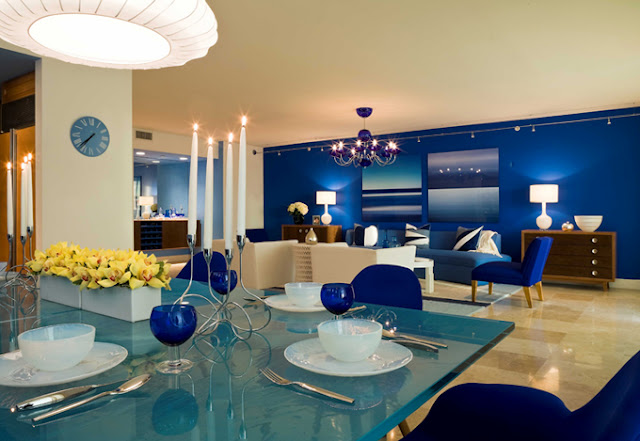
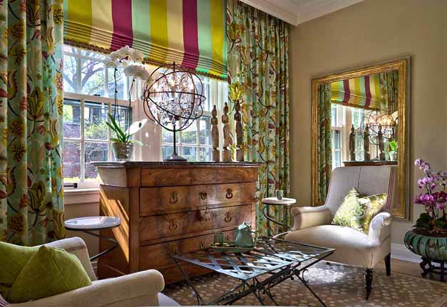
Wondering how to use these colors in your home?  Check out some great installation shots below!

I used a beautiful chartreuse, pink and ultramarine color scheme in the Lake Forest Coach House and the combination was delightful!

By mixing the fun pink with tangerine tones and neutrals, this room uses the beautiful fall colors in a way that doesn't make this room feel overwhelming.  Photo courtesy elledecor.com.

So, are you ready to add some color to your life?